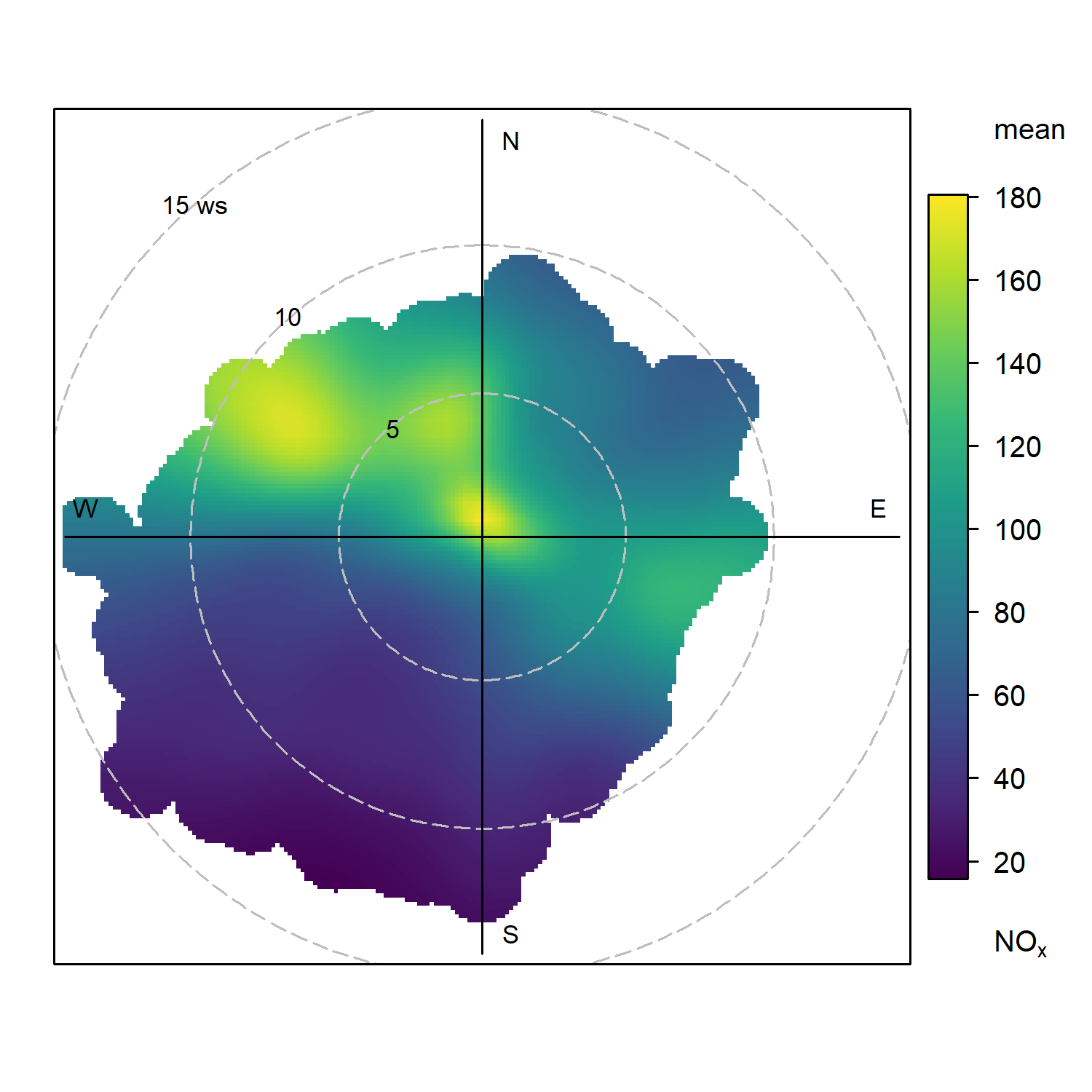
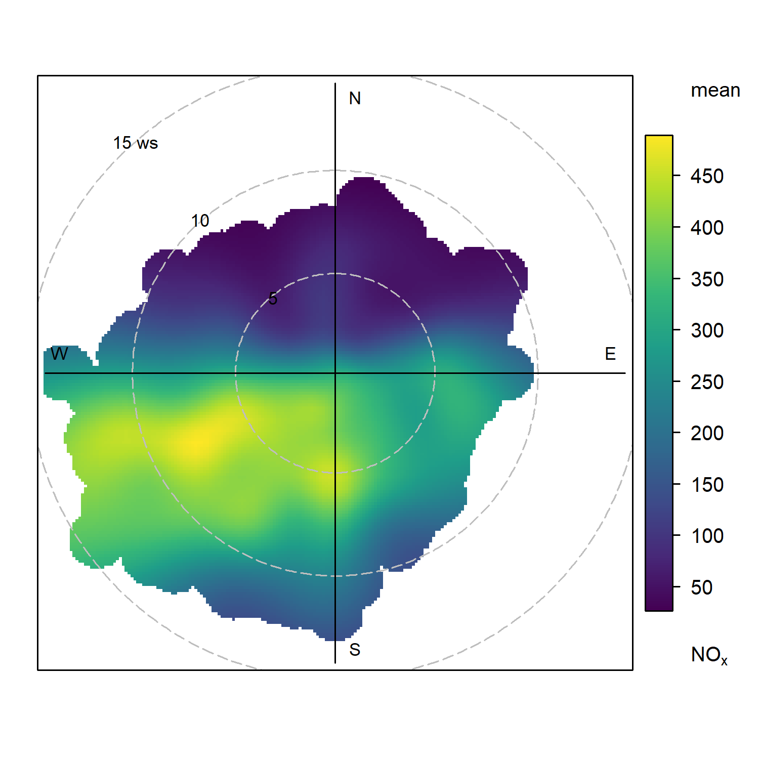
The map on this page is overlaid with a specific air quality data analysis graphic called a bivariate polar plot.
Bivariate polar plots help us to understand the origin of air pollution sources in the areas where air quality is being monitored in continuous, normally by making use of automatic monitoring techniques.
This is made by integrating the air quality readings that are being measured, with measurements of wind speed and wind direction taken at the monitoring site, during the same time period.
The bivariate polar plots on the map above use the last fortnight of data from 7 automatic air quality monitoring stations around Oxfordshire. The colours on the markers therefore represent the average pollutant concentrations at different wind conditions over the last 14 days.
The vertical and horizontal axes of the polar plots give you an indication of the wind direction, in a similar way as a wind rose or a compass would, with the cardinal points N (North), S (South), W (West) and E (East) being displayed.
The circular dashed rings give you an indication of the wind speed. This starts at zero (0 m/s) at the “bullseye” central point, and slowly increases outwards in all directions.
Wind Direction – Gives you a better idea of the direction where the potential air pollution source is coming from.
Wind Speed – Gives you a better understanding of where this air pollution source is located: if very close to your monitoring location or if it comes from further way.
Polar plots also display different colours. The darker colour of the surface corresponds to low pollutant concentrations, and the lighter colours to much higher concentrations.
|
Some practical examples (below):
For the analysis of polar plots, we need to take into account that sometimes our interpretations may be altered by knowledge of the location of specific sites.
For example, certain features of nearby terrain like tall buildings may cause air to disperse in complex ways, which may make a polar plot look different to what we would initially expect. Regardless, polar plots are a useful starting point to better understand potential sources of air pollution. |
| Site A | Site B | Site C |
|
|
 |
 |

TOP TIP:
When using the below map, please note that the region covered by the individual polar markers is not significant – the radial axes represent wind speed, not distance from the measurement site. Instead, focus on the directions from which the air associated with the highest concentrations appear to be arriving.
By default, only NO2 is displayed on polar plots, but ozone and particulate matter (all illustrated using different colour scales) can be displayed using the check-boxes.
This page was created by the openair and openairmaps R packages. Directions on the use of these packages, as well as a more thorough technical description of polar plots, can be found in Chapter 8 of the openair book.